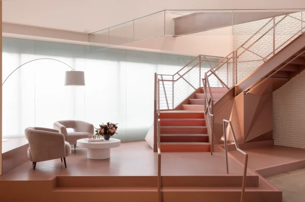
If there’s one element that most playfully sets the tone for the newly redesigned office of Selena Gomez’s Rare Beauty, it’s the multicolored staircase that stands in one of the lobby’s corners. The staircase serves no purpose—the office for the three-year-old beauty brand spans only one floor at present—yet it still stands as one of the most imposing elements of the space, catching eyes whether you want it to or not. Each of its steps has been painted in a shade of Rare Beauty’s Soft Pinch Liquid Blushes. This decision seems to echo the brand’s ethos: Let go of the quest for perfection and you’ll learn to have fun with what you have.

The painted staircase was the brainchild of Kelsey Fischer, the lead designer at Havenly, who worked on overhauling the office with the Rare Beauty team. At the beginning of the project, the space was sterile and cold—a vestige of the previous game developer tenants, it was dominated by bold greens and blues that feel far from the Rare look—but after the Havenly intervention, it stands as a workspace that is not only comfortable, but inspiring too.
At the beginning of the project, Fischer dove into the Rare Beauty brand archive, looking intently at the products themselves, but also the ad campaigns, the packaging, and the company’s social media presence. Rare Beauty launched in the thick of the pandemic, in September 2020, when remote work was a necessity, so this redesign stood as the first time the company would have a proper place to commune. “Especially working at a newer company and being in this transitional space between working remotely and being in an office, you work so hard and it’s not often that you get to see a representation of the thing that you’re working towards. I really wanted to bring that in as an aspect of the design and [give the Rare Beauty team the] feeling of being surrounded by their beautiful work.” Fischer tells AD.
Existing imagery of the products and Rare Beauty campaigns were added throughout the office, though all with the intent that it could easily be switched out as seasons and products change at the company. Though they considered using a series of TVs to make this change more effortless, they settled on prints because they felt more personal.
read more here.


